

The Meade County Messenger - Churches and Cemeteries - Front Cover
This was one of the first major designs I did after starting at The Meade County Messenger. The Messenger is one of the only independently owned newspapers in the state of Kentucky. I really enjoyed my time there and the staff who I worked with to create the newspaper each week.
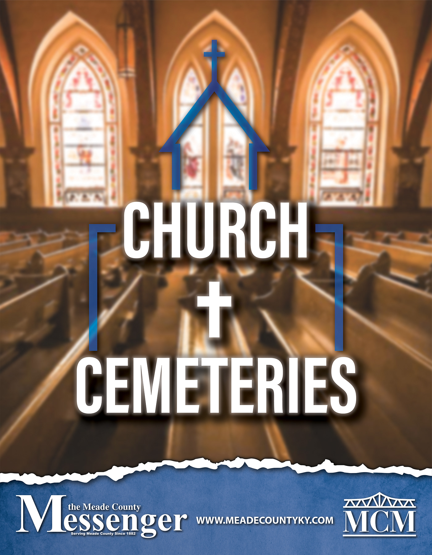
We also produced several magazines each year (on average about 4-6 issues per year) and this one was the first out of the gate after I started with the staff. This magazine has a weird title but it focuses on the rich history of various churches and cemeteries in the Meade County, KY area.
I really didn't have much direction on the cover art direction so I sketched out a few ideas. I had a vision of a soft, yet bright light shining through stained glass windows. I wanted to put the title of the magazine large and "front and center" on the cover but I also didn't want to obscure too much of the background.
We often worked with royalty free photos and graphics for news media so I downloaded this background photo from one of those websites (the name of which escapes me).
Since I had the soft, bright light coming through the stained glass windows, I decided to play with the focus of the image compared to the title. I put a slight blur on a duplicate of the image layer in Photoshop and then an opacity mask over that to fade that blurred background a bit as the viewer's eyes came closer to the lower portion of the cover.
Once I was satisfied with that, I put "Churches and Cemeteries" in a variation of Helvetica Bold Condensed font, set to All Caps. It looked just a little too plain though nice and legible against the background. I started to play around with the placement of the text, stacking the words above each other. I then had the idea of changing "and" to "&" but then thought about a "+" instead. Then of course I made that plus symbol a cross instead. I thought it was pretty clever. Then I put a bit of a drop shadow on the text and a similar glow and blur to tie it into the background.
Just staring at the stack of text, it kind of looked like a lower floor of a building with the next level slightly smaller, similar to a church with a bell tower. I decided to put an outline of a church intersecting the text. Finally I had an idea of a torn page at the bottom as if the photo was ripped away from the cover showing the publisher name.
Initially the color scheme followed Gold/Yellow ranges but I was voted down by the staff. I had to make several versions of the original, one in Blue, one in Red, one in Green, and the original Gold/Yellow. The Gold was more intense so it wasn't lost in the background and I felt it went along with a Catholic Church but the team all decided to go with Blue.
It may not have been exactly what I wanted in the end but it was one of our top movers. The cover grabbed the attention of everyone who passed.


